FlowPay - B2B Payment Dashboard Redesign
Flowpay is a 5-month redesign of a SaaS financial operations platform used by mid-sized businesses.
Role
Duration
Tools
Team
Project Overview
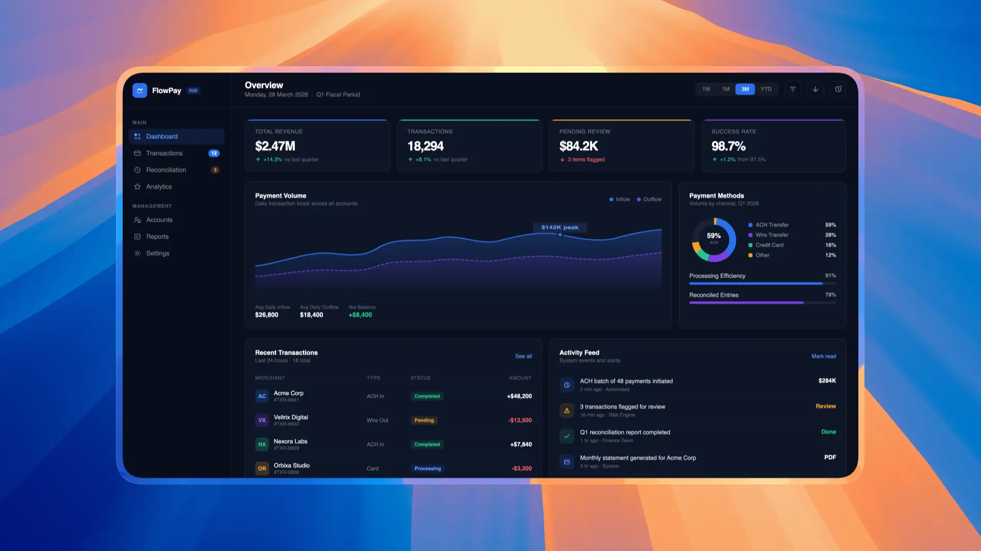
FlowPay is a B2B fintech platform serving 2,000+ businesses for cross-border payment processing. The existing dashboard was built 4 years ago and hadn't kept pace with user needs or modern UX standards.
I was brought on as Lead Product Designer to redesign the entire payment dashboard experience — from transaction management to reporting — with the goal of reducing user friction and increasing platform engagement.
Problem Statement
FlowPay's dashboard suffered from a 65% task abandonment rate during payment processing. Users were struggling with a cluttered interface, confusing navigation, and a 7-step payment flow that felt overwhelming — especially on mobile devices.
70% of abandonments happened during the payment creation flow
Mobile users spent 40% more time completing tasks than desktop users
First-time users were 3x more likely to contact support
NPS score had dropped from 42 to 28 over the past year
Competitors with simpler flows were gaining market share
Research & Discovery
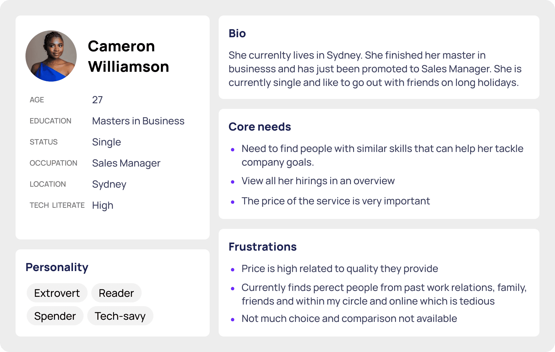
I conducted a 3-week research sprint combining qualitative and quantitative methods to build a deep understanding of user pain points and business context.
Key Findings
80% of users found the payment options confusing compared to competitors
Users needed an average of 4.2 minutes to complete a single payment
Finance teams wanted bulk payment capabilities but couldn't find the feature
The reporting dashboard lacked real-time data, forcing manual exports
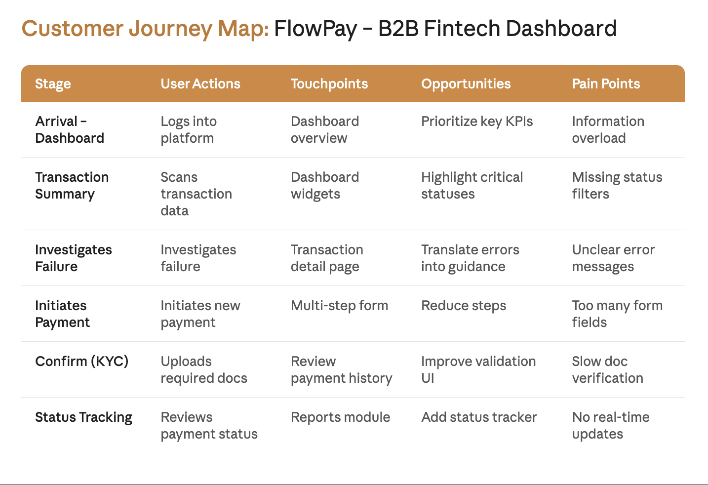
Ideation
Armed with research insights, I facilitated a 2-day design sprint with the cross-functional team. We used crazy eights, mind mapping, and dot voting to generate and prioritize solutions.
From 120+ rough concepts, we narrowed down to 3 directions and ultimately chose "StreamFlow" — a concept that reimagined the payment creation flow as a guided, contextual experience rather than a rigid step-by-step form.

User Flow
I mapped the complete user journey from login to payment confirmation. The primary goal was reducing the payment flow from 7 steps to 3 while maintaining all necessary compliance and verification requirements.
Payment details — smart defaults and auto-fill based on history
Review & confirm — all info on one screen with inline editing
Confirmation — real-time status with estimated processing time

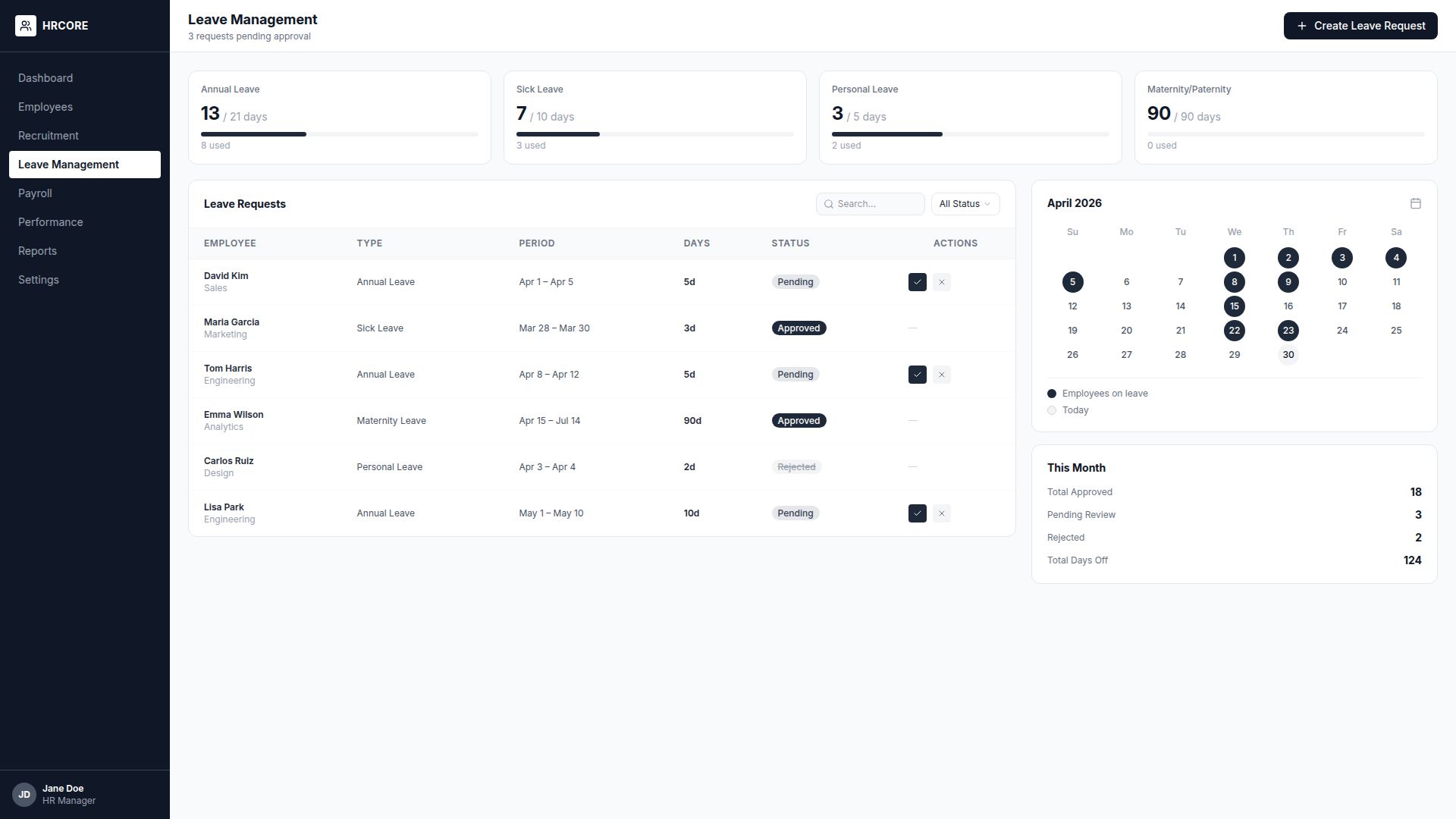
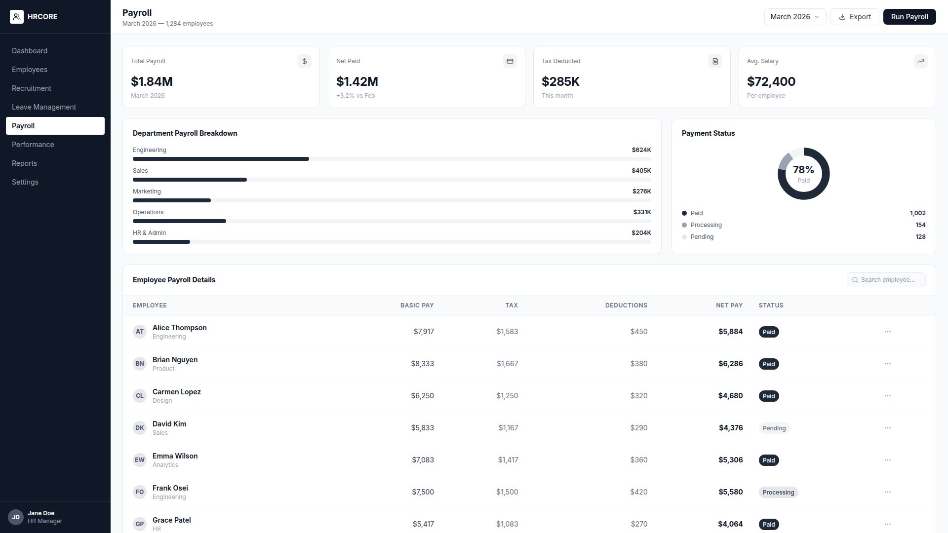
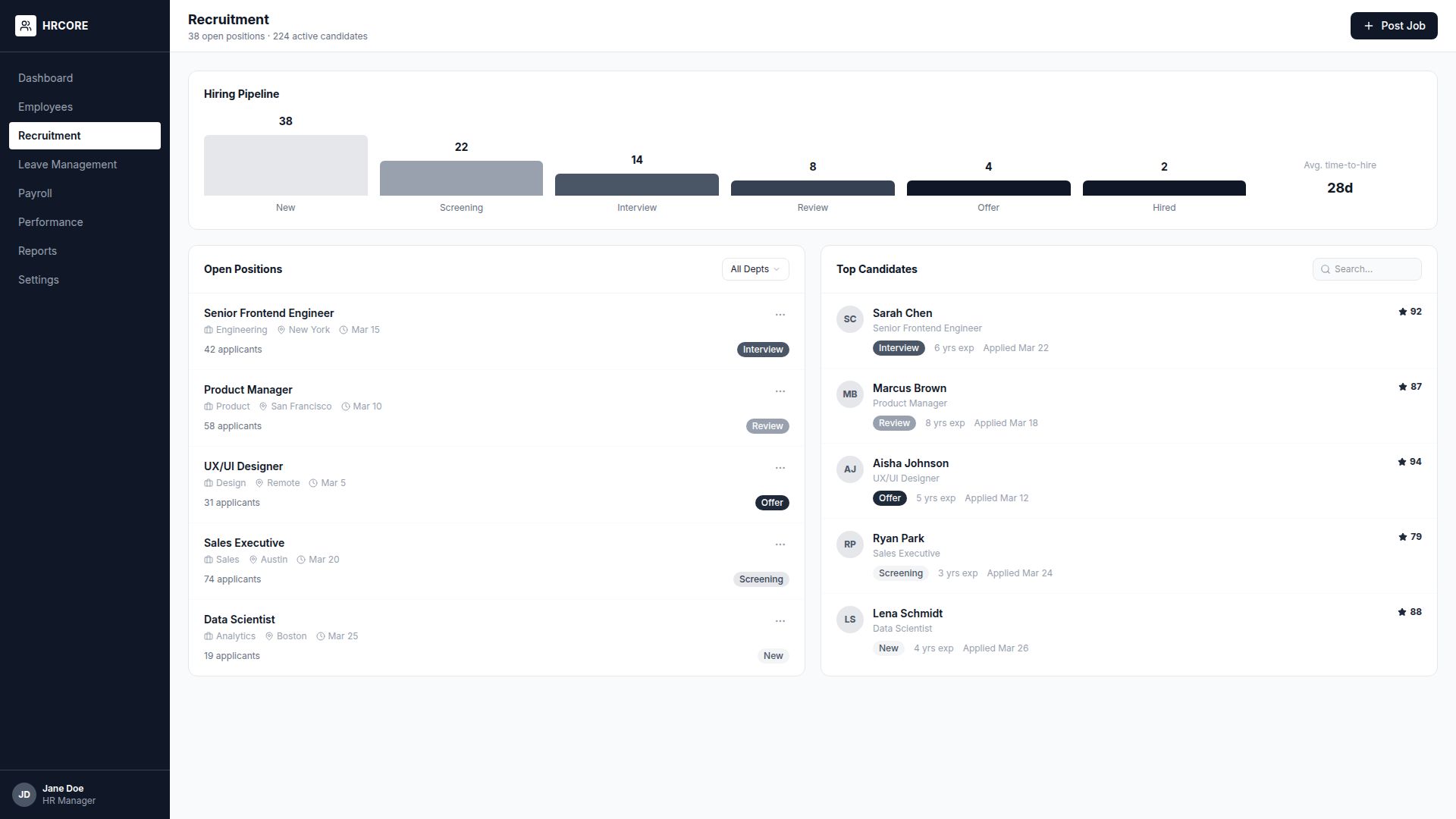
Wireframing
The final wireframes achieved a 92% task completion rate in usability tests, compared to 58% for the original design.
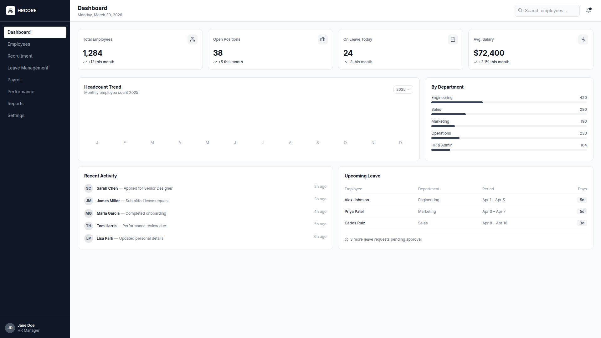
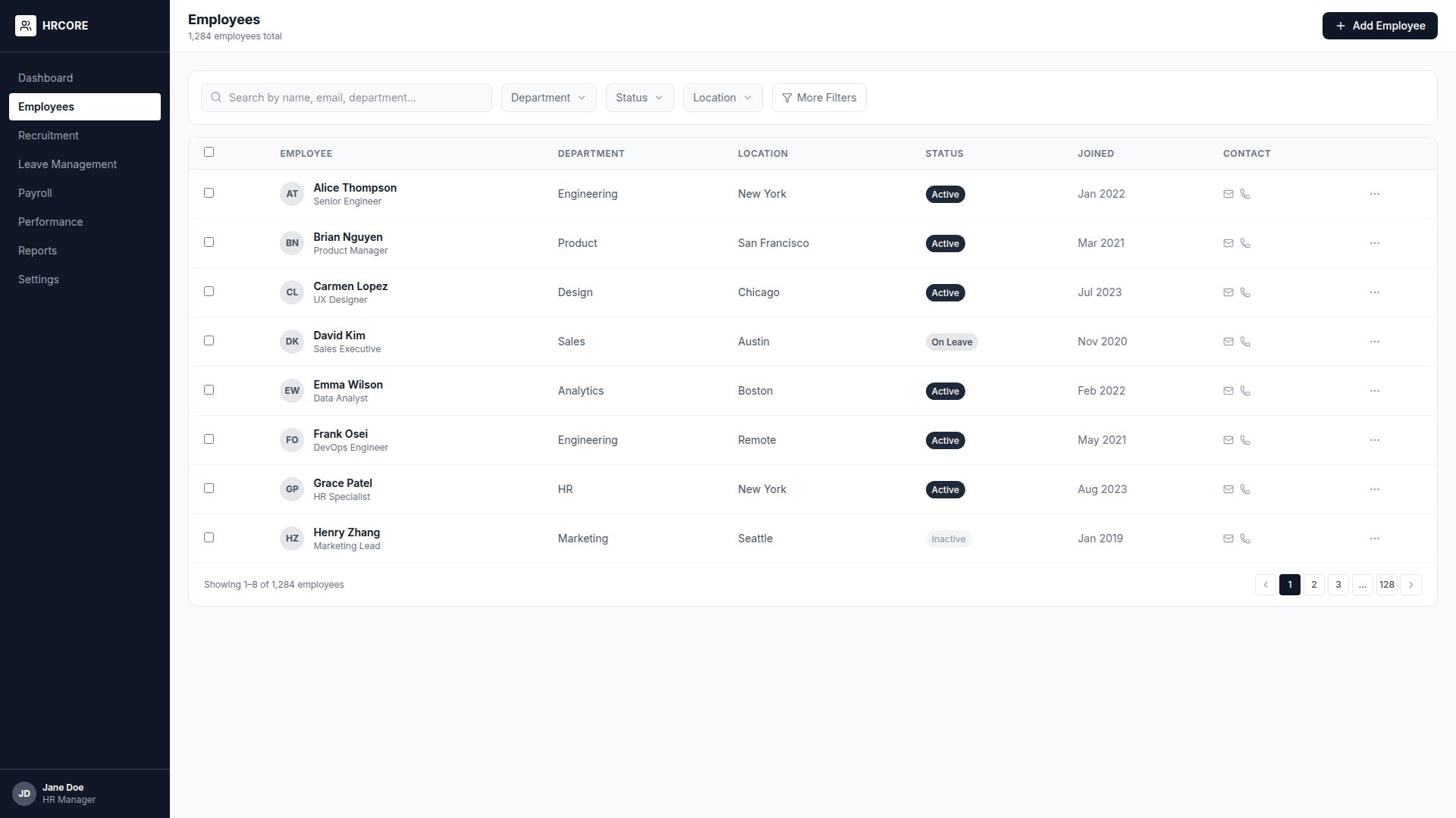
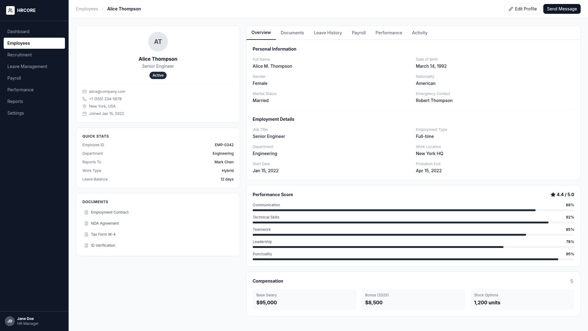
Visual Design
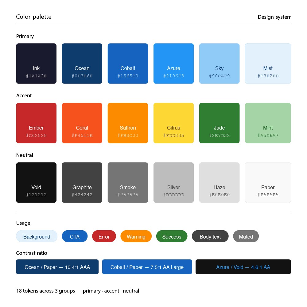
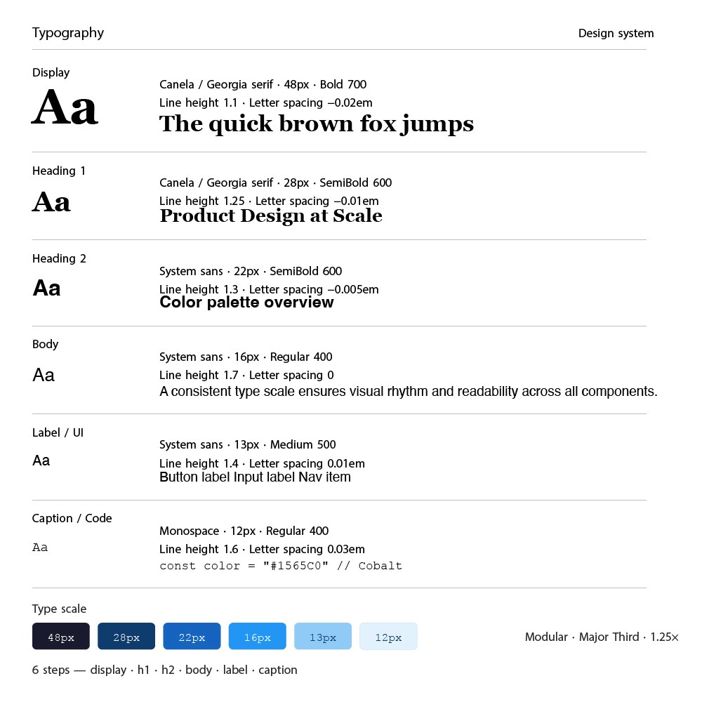
The visual design needed to balance professionalism (fintech) with approachability. I developed a clean, modern design system with a focused color palette and clear typography hierarchy.
Prototyping & Testing
I built a high-fidelity interactive prototype in Figma and conducted 4 rounds of moderated usability testing with 24 participants using Maze for unmoderated sessions.
24
Test Participants
4
Testing Rounds
95%
Task Success Rate
Iterations & Refinements
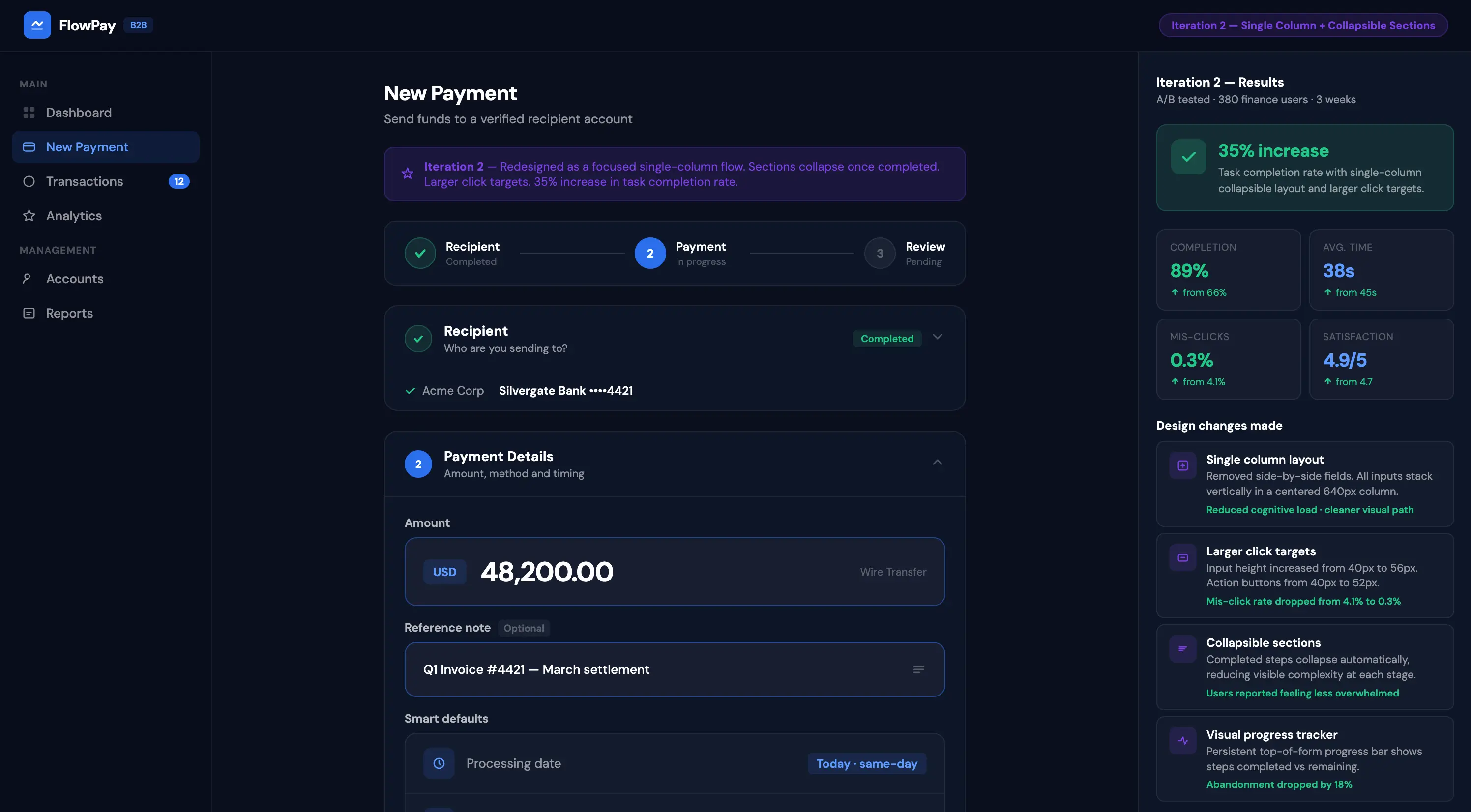
Iteration 1: Simplified the payment creation flow — reduced from 5 fields to 3 with smart defaults. Result: 20% faster task completion.
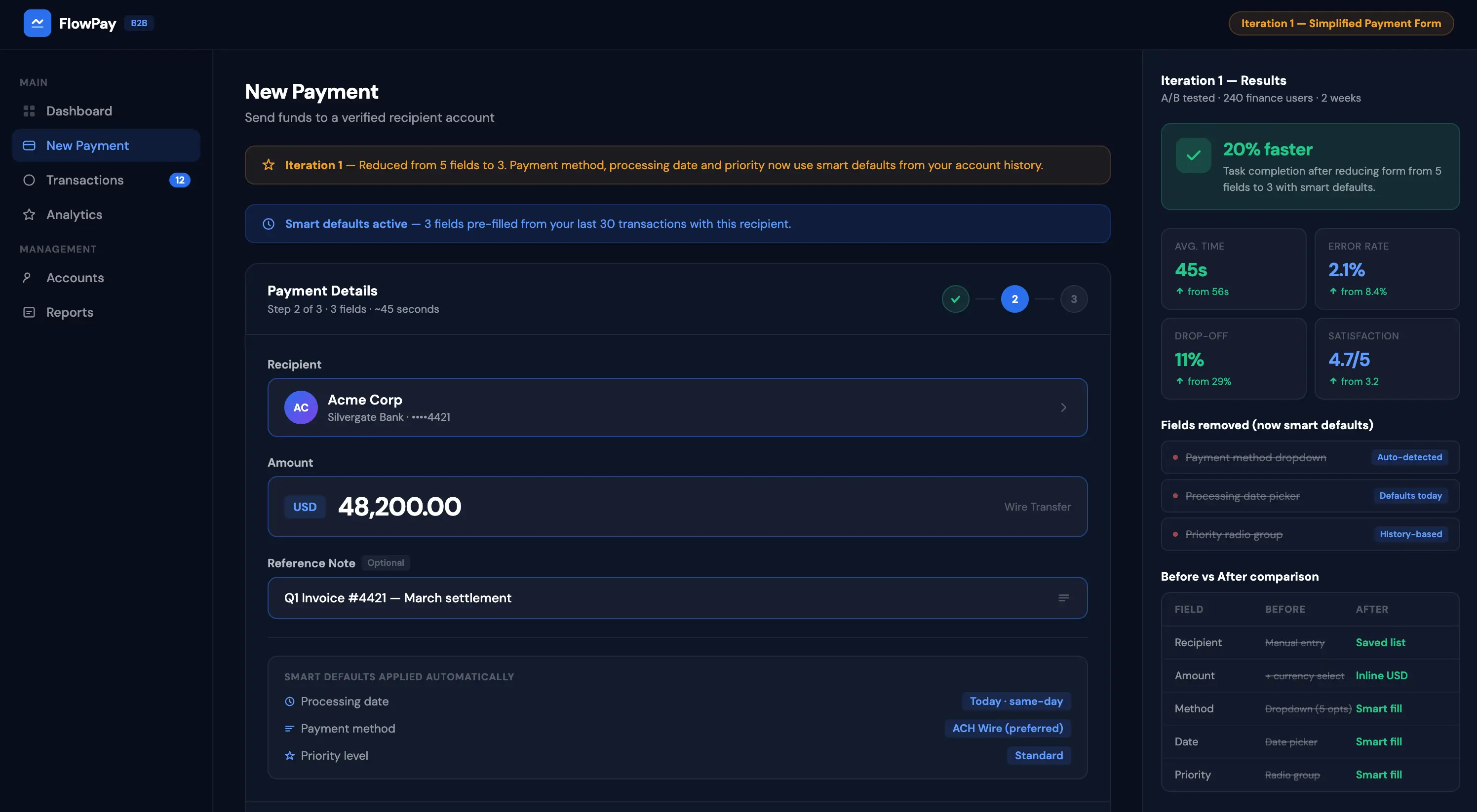
Iteration 2: Redesigned the mobile experience — single column layout with larger touch targets and collapsible sections. Result: 35% increase in mobile task completion.
Final Design
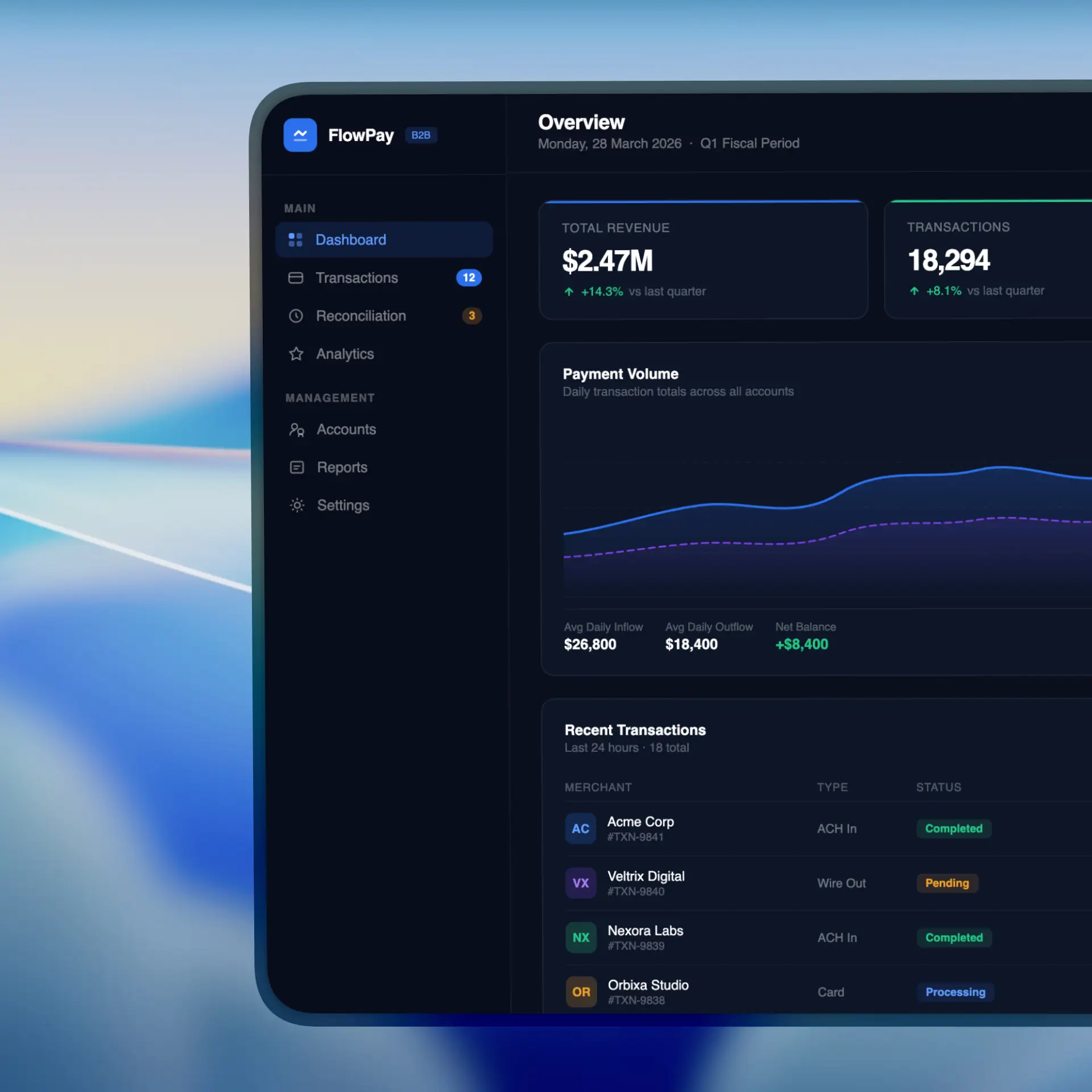
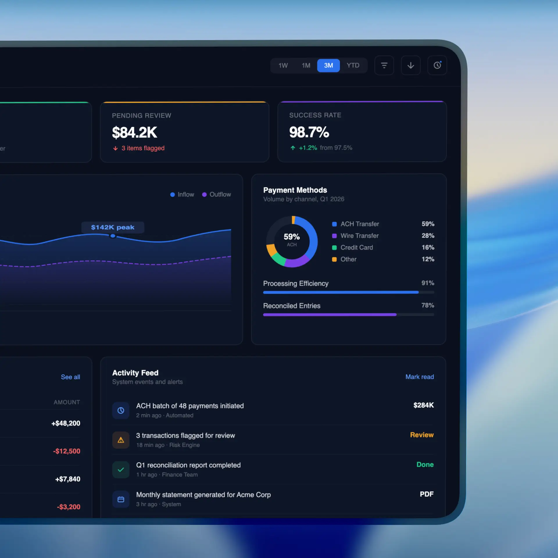
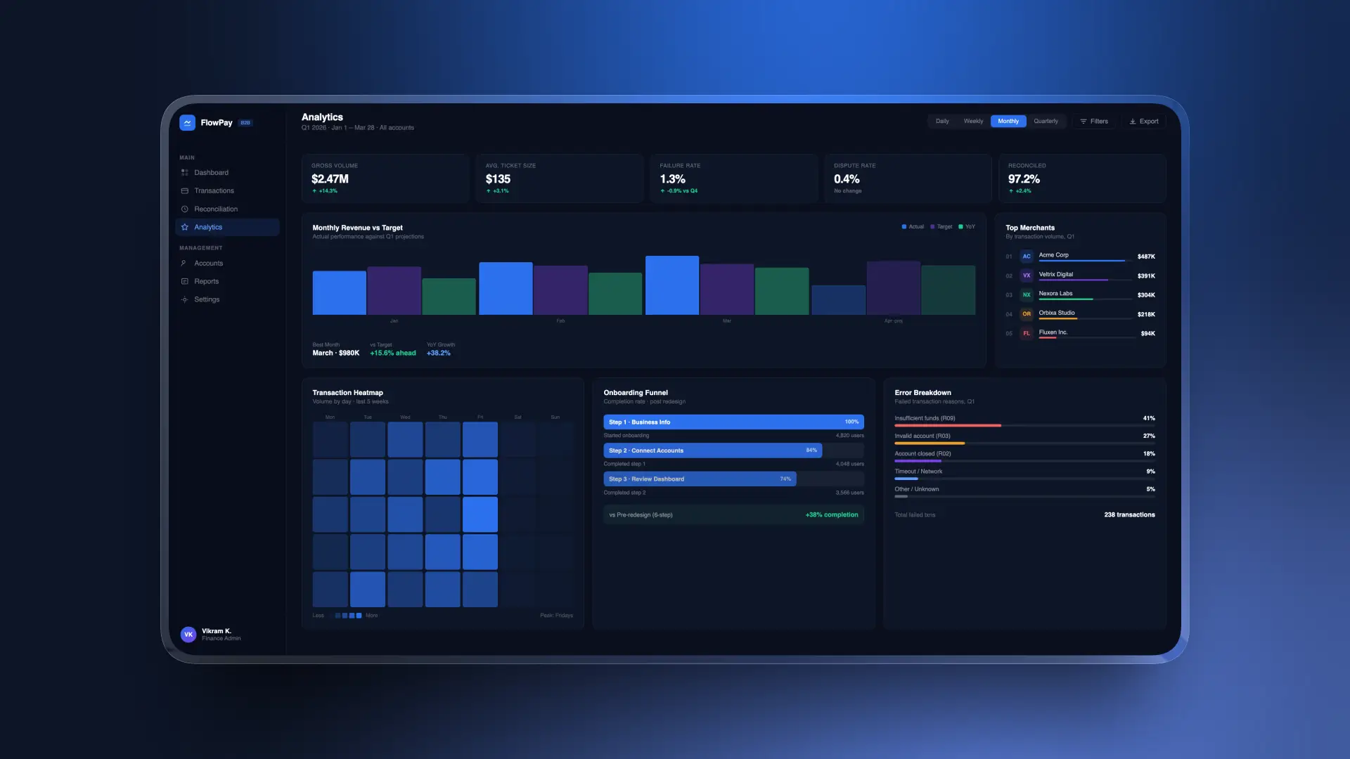
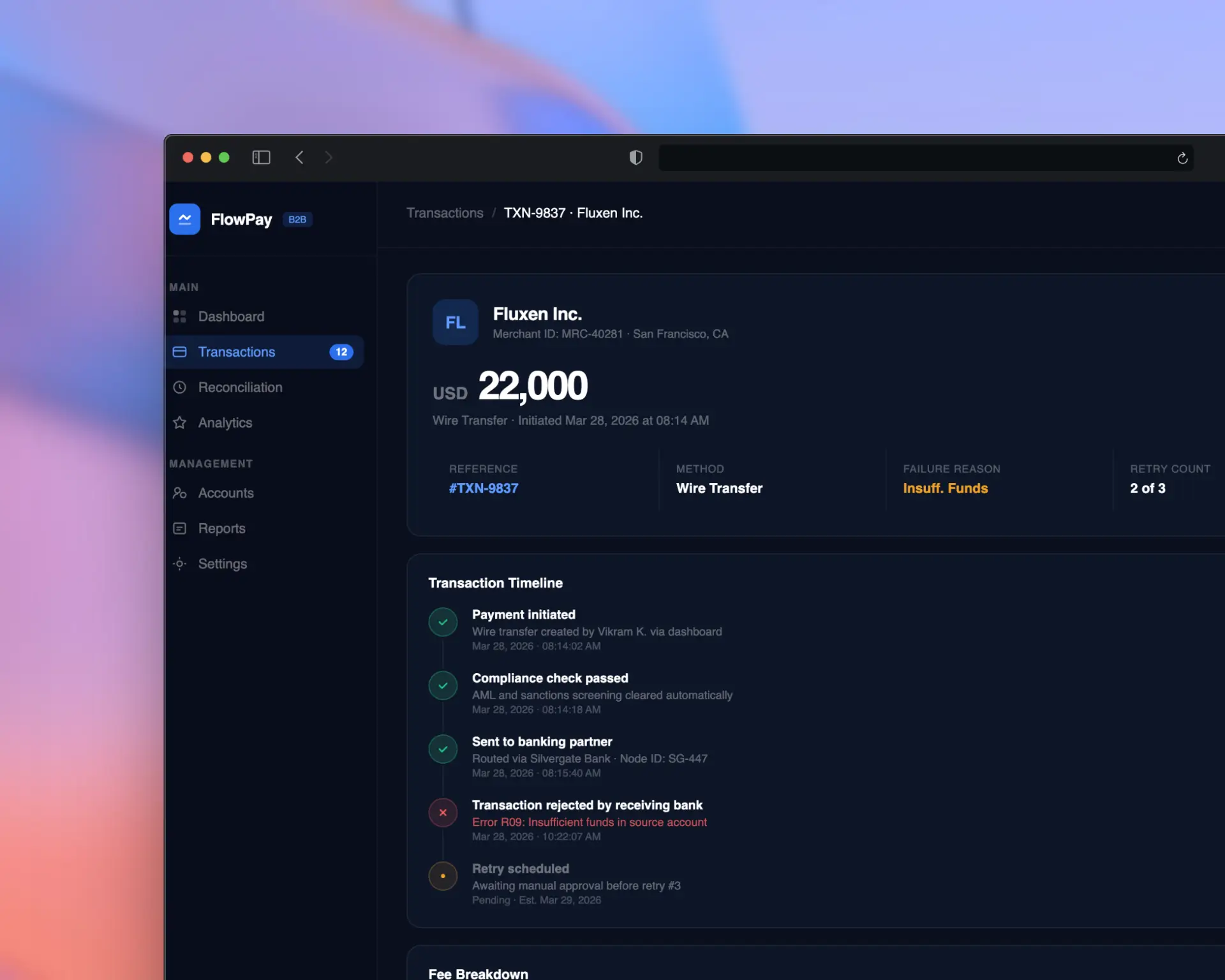
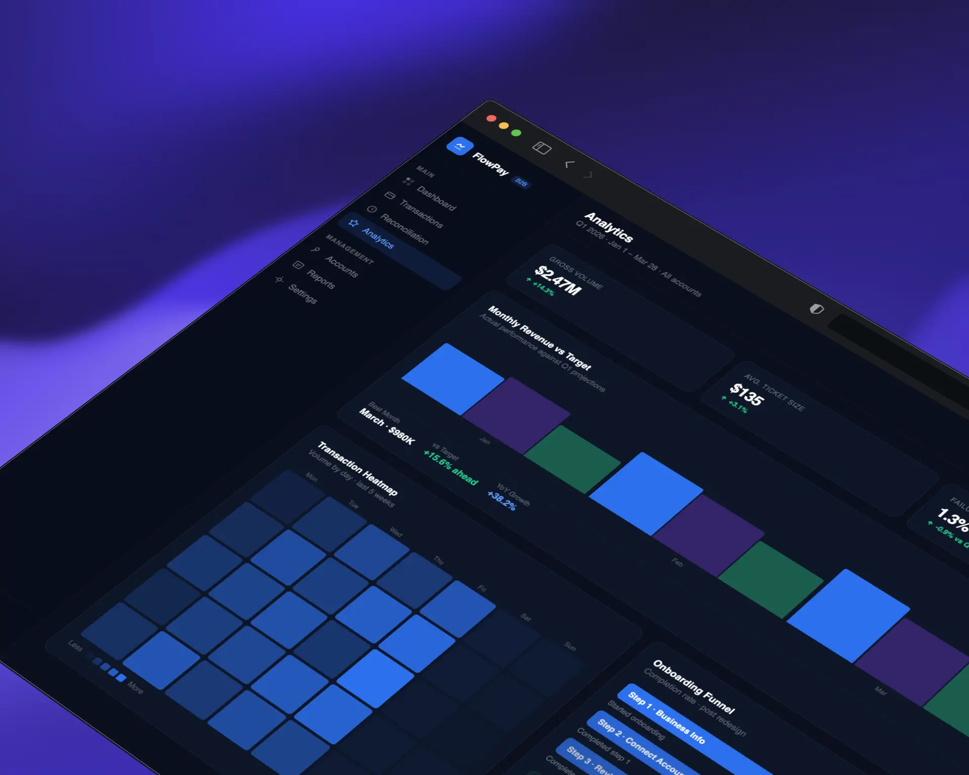
The final design, "StreamFlow," delivers a clean, confidence-inspiring payment experience across all devices. Key features include
3-step guided payment flow with contextual help
Real-time transaction tracking with push notifications
Bulk payment processing for enterprise clients
Customizable reporting dashboard with export options
Dark mode support with full WCAG AA compliance
Mobile-first responsive design with gesture navigation
Impact
58%
NPS Improvement
25%
On boarding drop-off
10
Support Reduction
The redesign paid for itself within the first month. Our support tickets dropped by 60% and customer satisfaction has never been higher.
Lessons Learned
Early and frequent usability testing saves months of rework later
Fintech users prioritize trust and clarity over visual flair
Mobile-first doesn't mean mobile-only — power users still need full desktop capabilities
Collaboration with developers early in the process leads to more feasible.
Next Steps
Implement AI-powered payment categorization and smart suggestions
Build out the design system into a shared component library
Expand analytics dashboard with predictive insights
Conduct longitudinal study to measure 6-month retention impact